Styled components
Create styled React components with CSS, supporting server/client rendering, streaming SSR, and React Native using a single API.
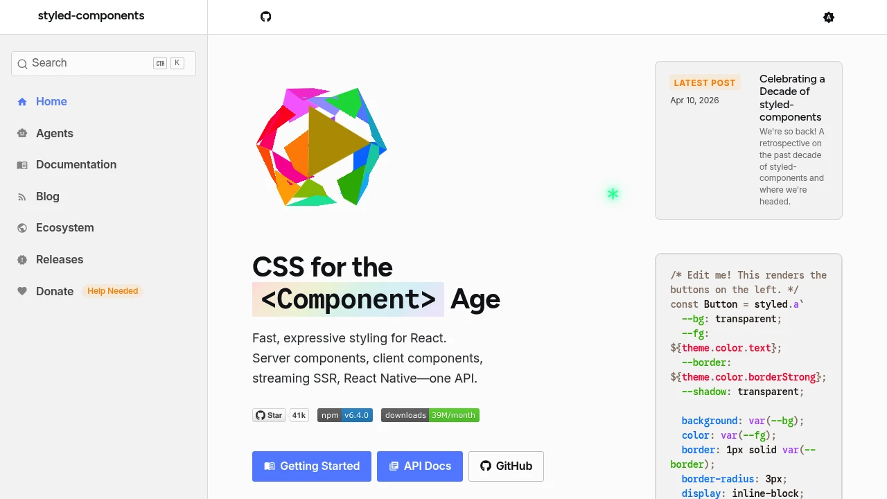
styled-components allows you to write actual CSS code to style your React components, enabling a more natural and expressive way to style your application. It supports server-side rendering, streaming SSR, React Native, and both server and client components, all through a unified API. You can define styled components with familiar CSS syntax, including media queries, pseudo-selectors, and nesting, directly within your JavaScript files. This approach promotes component-based styling, making styles more modular and maintainable.
The library provides powerful features like interpolating props into styles, enabling dynamic styling based on component properties. For example, you can create a <Button /> component with different styles for normal and primary variants by passing props. styled-components also supports theming, allowing you to define a theme object and access theme variables within your styles for consistent design.
Getting started is straightforward: install with npm install styled-components, import styled from the library, and define styled components using tagged template literals. These components are React components that render with the specified styles, making it easy to build and reuse styled elements across your application.
Overall, styled-components offers a flexible, powerful way to style React applications with CSS, promoting better organization, reusability, and dynamic styling capabilities.
Similar to Styled components